
Eclipse
9 Weeks
Research, Design, Prototyping, Testing
Clara Bradford, Elisa Krebs, Aswati Panicker
CONTENTS
1: Quantum elephant
2: WHITEBOARD OLYMPICS
3: thinkering
4: into the wild
5: REFLECTIONs

1: quantum elephant
Prompt | Ideal Users | Problem Framing
Design for Respect, They Said (1)
For our prompt, we were told to design for respect.
To do this, our team first had to have a very difficult conversation.
We are deeply fortunate to be comprised of men and women, as well as people from different cultures, religions, and sociopolitical backgrounds. As a result of this diversity, however, the very first question we had to settle was: What does respect mean to us - and how are we going to design for it?
Respect is a difficult word. Like some quantum variation of the proverbial elephant in the room, respect can’t be ignored, and yet simultaneously defies any easy definition.
Over the course of our project, we came to approach respect from a set of different angles. Our research would ultimately lead us to keep our design frame non-combative, non-condescending, and positive in all aspects of its nature - and the secret of better understanding our user proved hidden in this very word, all along.
What does respect mean, anyway? Whiteboard from from Design Session 1.

User Constellation: A person is not one aspect, but a series of aspects. Each node represents a quality or attribute.

Respect =/= Acceptance: Just because we might not accept one aspect of a person does not mean we do not respect them. At the very least, it does not mean we cannot strive to be respectful.
User as Constellation
In hindsight, Eclipse ended where it began - contending with the reality of people.
Pooling our predispositions and gathering a general consensus, we moved forward with a user as constellation model of understanding (shown left) and decided to target the workplace rather than an academic setting under the collective assumption that companies and other corporate environments (e.g. government) have a long way to go in the game of respect.
But who was it going to be for?
Here we hit our first significant roadblock. We all knew that any strong design would have a clear user at its heart. We believed - and believe - a clearly articulated user keeps an honest designer honest.
Targeting a corporate environment, however, proved problematic from a user-centered design perspective. There are two tracks of worker in a corporate environment: the supervisor and the team member. Put simply, if mostly informed by the specificity of an ideal user, our final design would either empower the worker - or it would enable the supervisor.
Yet the needs of these two user groups are often at odds with one another. Helping one risks hurting the other. While it might be seemingly noble, for example, to defend the underdog in any power structure, from what angle do we as designers realistically stand a chance to affect meaningful change?
The answer seemed to be: from as high up in the chain of power as we can aim.
Yet is this not a betrayal?
Don’t we have a duty to design for those who need our help the most?
User as Person
This tension - which we would come to call the issue of the ideal user - would circle back at various stages throughout our design process, growing increasingly problematic as we conducted interviews with faculty, members of student groups, and then later as we expanded to interviews and usability tests with industry professionals (including team members and supervisors) from corporate, medical, legal and government environments.
Rather than be buried as the design came into its fuller expression, the question of the ideal grew bigger and more insistent with each successive iteration, until it was being asked by people outside the team who wanted to know: I love this, but who is this for? The mystery was maddening - the design was working, it was growing, it was getting better. But at its heart was an optical illusion, one which - like an eclipse - proved blinding if we stared.
For the purposes of forward momentum, we decided to identify team members and team leaders in a corporate environment as our target user group. We were unsatisfied with this, all of us feeling that it was somehow incomplete. Due to time constraints, however, we agreed to move forward with the hopes that a clearer target user would arise from further research, problem and solution framing, and user interviews.
The epiphany, when it came, boiled down to one thing: our early notion of an ideal user was misguided. As designers, we must contend not with ideal users, but with real users - because a real user is beautifully dynamic, an insight I will discussed in greater depth in Chapter 5.
For now, however, I submit that any designer would do well to start their project by asking what I’ve come to call the Two and a Half Questions: Who? Why?
And why now?

2: whiteboard olympics
Research | Concepts | Problem Frames | Artifact Analysis

Shown above: The Respect-O-Meter, as first sketched in Design Notebook No. 1. We interrogated a silly idea with serious questions - who is our user? Why would they use this? If we were in their shoes - why would we wear Respect Goggles? Why should we?
The “Respect-o-Meter”
Early brainstorming saw its share of silly ideas.
While we abandoned nearly all of these ideas, some came to inform our final design in strange and subtle ways. One such concept - coined the “Respect-O-Meter”, which was built into a pair of wearable “Respect Goggles” - would tell users someone’s “Respect Rating” if they looked at someone as they passed them on the street.
While the Respect Goggles (and Respect Rating) were ultimately consigned to the ash heap of history, the power of visually representing an intangible status would work its way into the Eclipse design in the form of contribution wedges.
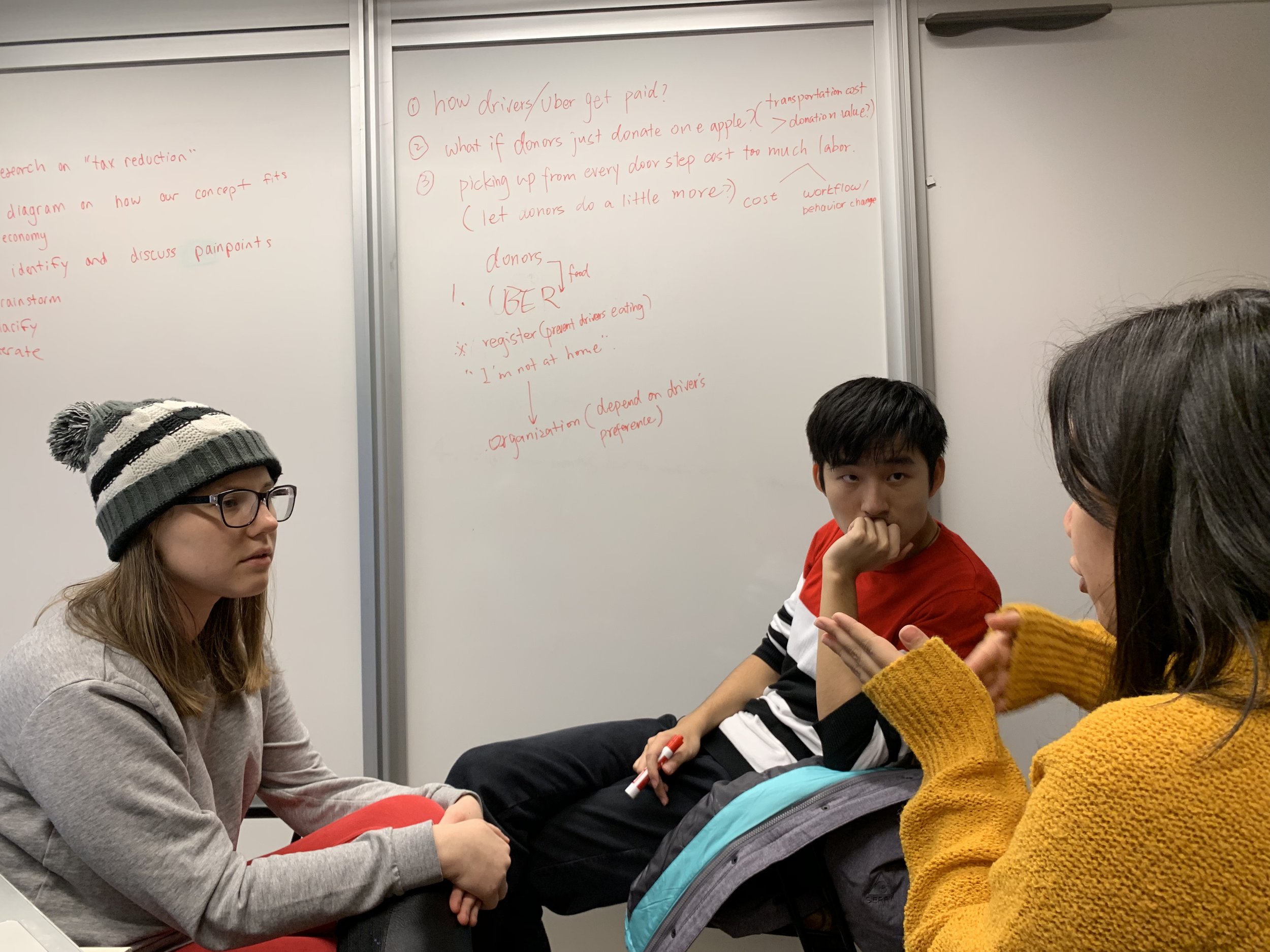
Meeting Minutes
As we identified the metaphorical “meeting room” as a primary pain point for nearly anyone who interacted with it, we conducted early observations of students as they held group meetings.
While we knew student meetings were very different than corporate meetings, we believed (and believe) there were enough similarities between the two that we could at least begin to identify some big picture pain points.
These observations were informal, and primarily served to validate some of our broader assumptions: namely, that meetings are stressful, regardless of environment.
This assumption was validated, after observing multiple confrontations and tense conversations.

Shown Above: The Catharsis Box (left, vertical) as well as its pros and cons after a round table discussion.
The “Catharsis Box”
It was from one such observation of a particularly tense meeting that we conceptualized a so-called “Catharsis Box.” The Catharsis Box would help people process their real time frustrations while in a meeting by allowing them to tap a button in a phone application whenever they felt slighted.
For every tap a user generated, a fire would be stoked within the Catharsis Box. The box itself a digital representation of a lockbox. The team lead - who alone held the lockbox key - could see the inside of the box represented real time on their screen.
An attentive team lead, therefore, might look in the Catharsis Box to discover a roaring fire, and as a consequence might call for a break in the meeting - even if there had as of yet been no confrontation - in an effort to let spirits cool.
Early concept tests of the Catharsis Box made it clear that - regardless of any other potential value - it would be painfully (and hilariously) obvious if someone was frustrated in a meeting, as they would sit glowering in a corner, furiously tapping their phone as someone spoke over them.
Yet despite this design non-sequitur, the Catharsis Box - much like the Respect Goggles - ultimately revealed something important to us that we would carry forward into our final design: the importance of user anonymity.
This insight directly affected how we diagnosed the shortcomings of the Babble project.
The First Frame: Gender
Why We Almost Chose Gender…
During our early brainstorming and observation sessions, as we decided to target the meeting room. With this in mind, we began to conduct secondary research to see if our earlier assumption (that most companies have a long way to go in the game of respect) was a correct one. Our research revealed this assumption not only to be correct, to be painfully so. It also led us to our first concrete candidate for a problem space: the tension between men and women in the workplace.
“Men will dominate 75% of the conversation during conference meetings.”
Here, the discussion about the ideal user returned for the first time. Could, perhaps, our ideal user be a working woman in a corporate environment - regardless of her station? How would that effect our earlier conundrum about where our services were needed most? With this in mind, we set out for knowledge.
An excavation of this subject proved as disheartening to us as people as it was exciting to us as designers. The relationship between men and women in the workplace proved a rich design space precisely because it was so fraught with challenges and hurt. It was here that we encountered uncomfortable numbers, but perhaps most informative was the statistic from the Journal of Language and Social Psychology which indicated that men interrupt women 23% more often than they interrupt other men. Vitally, this data point drew our attention to idea of interruption - a key stepping stone in the eventual evolution of our design.
As we explored existing solutions and designs aimed at addressing this disparity, we encountered an application called the Woman Interrupted App. There were several aspects of this product that we appreciated and drew inspiration from, including: the preservation of user anonymity; the fact that conversations were not recorded; the fact that the design strived to encourage more evenly distributed conversations; and from a visual standpoint, we were moved by the use of bold colors and a minimalist design.

Shown above are screens from the (now inactive) Woman Interrupted App website. This application heavily influenced our design, and is ultimately responsible for our decision to create a non-combative product. Source
…And Why We Didn’t
Yet there were problems with the Woman Interrupted App, as well, and those problems ran deep. We were discouraged and disappointed, for example, by the combative language of the Woman Interrupted App’s tutorials and mission statement. Perhaps most insidiously, however, the Woman Interrupted App assumed that if you were a man, you were interrupting your female colleagues. Likewise, it assumed that if you were a woman, you were being interrupted by a man.
Our ultimate assessment of this application generated a new and deeply formative question: what is the cost of a politicized product? While no doubt stemming from a place of good intent, the combative stance of the Woman Interrupted App risked alienating half of its potential users based on their gender before it even got onto their phones. After a round table discussion, we elected to learn from this product, but agreed that our design should take an intentionally non-gendered, non-combative stance. This resolution would inform a series of decisions throughout the design process.
“A non-gendered application is more widely inclusive. For example, a minority group - or any other marginalized group - might not feel they have a rightful claim to an application that declares itself ‘for women’. A non-gendered application belongs to everyone who needs it.”
The Second Frame: Interruptions
Don’t Call Me Shirley
Having moved on from the gender problem, we returned to the question of interruption. Revisiting the idea of respect - and how difficult it can be to identify a universally acceptable definition of that word - we synthesized that fluidity with the notion of interruptions. No matter what your background or culture, we reasoned, nobody likes to be interrupted.
Perhaps our design - which was now beginning to take shape as some form of a conversation tracker - could track interruptions? Surely, we thought, interrupting someone is universally disrespectful. Surely, regardless of background or context, interruption was never good.
Surely, this was our unmovable point upon which to build our design.
We were wrong, of course. But we will return to this in a moment.

Above: This was one of our early function flows, which still included features which would not be carried forward, including “Respect Ratings” and an “Interruption Tracker”.

Above: We outlined the pros and cons of including the various features we were considering for our application.
I Love Your Idea…
At this point we began to build out flowcharts of desired design functions. We at first felt that targeting interruptions would be a safe metric to visualize. Yet further observations of group meetings revealed a game changing insight: interruptions are not inherently disrespectful.
In three observed meetings, people would get so excited about someone’s idea while they were speaking that they would jump in and “co-op” the conversation. There was nothing negative about this behavior; if anything, it was a sign of approval and support. We were then faced with a problem: how would we realistically teach a program to differentiate between a positive interruption and a negative interruption? Perhaps more importantly - what were the implications of these so-called “co-op’ed” conversations, if there were any at all?
…I Think I’ll Keep It.
Our research into this phenomenon revealed a troubling scenario.
As documented in a study published by the Harvard Business Review, a woman named Cheryl was in a meeting. Over the course of the meeting, Cheryl raised the most ideas, which were then enthusiastically supported by a colleague named Phil. Phil often iterated on Cheryl’s ideas and expanded on them - something that Cheryl reported as making her feel supported.
Yet when later asked who had generated the most ideas, attendees of the meeting incorrectly attributed the ideas to Phil, despite them not originating with him. This, coupled with the fact that men tend to dominate 75% of conversations in a conference setting, indicate a troubling reality: quantity can outweigh quality in terms of how people are perceived in group meetings. The question then became: How could we address outside perception of our users while remaining non-gendered, non-combative, and preserving user anonymity?
The Third Frame: Contribution

We looked to various forms of visual inspiration. We loved the use of color and language to convey a mood. Image Source
The First Language
Recalling the vibrancy of Woman Interrupted App, we began to explore a visual language with which we might capture and convey complex and nuanced information. How could we use color and physicality to effectively communicate data and enable user insights without being judgmental?
We looked for inspiration in a wide range of places, while also considering what could be represented visually and understood at a glance. For our third frame, we selected contribution time as something an application algorithm might easily - and impartially - track.
“If the meeting was recorded, and somebody timed how much talking each person did and added it up, then certainly I’d like to be more aware of the fact that I may be hogging the conversation.”

3: thinkering
Wireframes - Iteration 1 - Iteration 2
Hello, NSA
Knowing now that we wanted our design to be at home in a corporate environment - and based off our research into the existing tensions in such environments - we decided to move forward with a mobile application/chat plugin that tracked the verbal contributions (in terms of time spoken) during meetings.
Eclipse in a Nutshell: Supervisors assign team members to their team. Users attach their voice to their handle in the system. The application then listens to the meting until told to stop, and forgets what is said. Contribution levels are represented using visual language, ignoring language barriers.
Vitally, our application would neither record content nor make judgments about whether speaking more or less was a good or bad thing. The design would only gather data about the amount of time people spoke - leaving judgment to the team lead.
Early wireframes prioritized what we would eventually call the Contribution Wedge; a visualization of conversation contributions in a pie graph. The wedge is the beating heart of our design, and as such we knew it had to be front and center of the application, even in name. Other features (monthly aggregates, team lead contact capability, and curated recommended reading) would either come later or not at all.
Due both to the visual nature of the Wedge (and the implications of being overshadowed) we decided to call our application Eclipse.

Shown Above: We each contributed potential names for our application. These were four of the candidates. From Design Notebook No. 1
“Eclipse: Noun. The total or partial obscuring of one celestial body by another. Verb. To reduce in importance or repute.
”
Team Member Flow: First Iteration


Supervisor Flow: First Iteration


I Sit On The Fence, My Grass Is Always Green
Early feedback to our initial vision for the Eclipse app was positive, though it left a few parties we interviewed confused concerning some points we’d taken for granted. One individual was skeptical of the idea that team leaders were a necessary component of a business endeavor. In this view, the Eclipse application would be hindered if a meeting was conducted without someone in a designated leadership position. Another interviewee was turned off by the support systems inherent to the Eclipse app, saying it was not their responsibility as a supervisor to “babysit” their employees.
“Feeling unappreciated was a top reason for employee exits in 2017.”
This led us to further discuss the nature (and responsibilities) of leaders in the workplace. Again, we returned to the troublesome issue of nailing down who our ideal user was. We felt confident in our user group - but specifically, who was Eclipse for at the end of the day? We argued that Eclipse served everybody; for supervisors, it afforded them vital information as to who is speaking at what rates in meetings, as well as information on what goals their employees are setting for self improvement. Towards this end, the diligent supervisor might endeavor to make sure they recognized the effort of their charges. For team members, Eclipse afforded them an inside look into how people in their organization might perceive them - for good or for ill.
Team Member Flow (Iteration 2)


Supervisor Flow (Iteration 2)


Nuts and Bolts
Further user interviews pushed us to experiment with a more streamlined home page in the application itself (as shown in the second iteration screens), as well as an overall simplification of user input possibilities.
This stemmed from a question from a panel as to whether we saw Eclipse as a stand-alone application or as a plug-in that might be available to existing chat platforms such as WebX, Slack or Zoom.
Future iterations would also see us reconsider the pie graph to better accommodate our color blind users. Towards this end, we began to think of offering a pattern based delineation.
“I like this idea. But what happens if the team lead is colorblind, like I am?”

4: into the wild
Usability Testing | Findings | Ideal vs. Real Users

Shown Above: Our user testers came from a wide array of professional backgrounds. Logo Sources: (Versprite, IBM, L&LR, Wexner Medical, SRC)
Hoist the Colors
Equipped with the third iteration of our Eclipse prototype, we ran a series of usability tests. These usability tests followed two user flows: that of the supervisory perspective and the team member perspective. We drew our testers from a wide pool of career fields, including medicine, law, defense, cyber security, and information technology.
We identified our testers by checking to see if they fit two characteristics: that they felt they worked in a somewhat “corporate” environment, and that they conducted or participated in a large number of meetings every week.
Our testers also covered a wide spectrum in terms of responsibility, ranging from a Program Director at IBM to an informatics pharmacist at at the Ohio State University Wexner Medical Center.
Other user testers included security consultants, lawyers, and program managers. Following an insight from our first usability test, one question we asked every tester was:
Do you feel like Eclipse is on your side?
Two User Flows
First User Flow: Supervisor
The supervisor Flow as presented during testing.
Team View Included
Second User Flow: Team Member
The Team Member Flow as presented during testing.
Individual View Only
Five Usability Tests
Tester 1: Program Director
Works at: IBM | Meetings Per Week: 25 | Status: Supervisor
Notable Quotes: “I manage managers.” “How is this data being used?” “What if Eclipse tracked how many times you interrupted or spoke over people, but it only showed you and not your team lead?” “I think the non-gendered approach was the right one.” “This would go a long way to fight for inclusivity.”
Tester 2: Attorney
Works at: L&R, P.C. | Meetings Per Week: 3-5 | Status: Team Member
Notable Quotes: “How are you making sure this doesn’t turn into a tattle-tale app?” “I like the idea of tracking interruptions, but how would that work?” “What happens if I’ve had more than one meeting today? Would it show me my most recent contribution or in aggregate?”
Tester 3: Project Manager
Works at: SRC | Meetings Per Week: 8-10 | Status: Supervisor
Notable Quotes: “I assume the one who spoke the most is me, since I’m leading the meeting.” “I’ve got a guy who spends a lot more time listening and absorbing, and less time actually speaking, but he makes a valuable contribution when he speaks.” “I can see the benefits, but I’m big on quality over quantity. You don’t want people to talk just to talk.”
Tester 4: Informatics Pharmacist
Works at: Wexner Medical Center | Meetings Per Week: 8-15 | Status: Team Member
Notable Quotes: Re: the Microphone Screen - “I feel like this screen is a little ambiguous. I think it could use some more words.” “I feel like this experience is designed for both [myself and my employer].”
Tester 5A: Security Consultant
Works at: Verspire | Meetings Per Week: 9 | Status: Supervisor
Notable Quotes: “You’ve just got to make sure that this app doesn’t make people feel bad for speaking less.” “I’m a big quality over quantity guy. [Some people] just talk and talk and say nothing.”
Tester 5B: Security Consultant
Works at: Verspire | Meetings Per Week: 9 | Status: Team Member
Notable Quotes: (Roleplaying as Jack) “I assume I spoke a lot in this meeting, because the big gray wedge is the same color as my name.” “Eclipse is not against me, but it’s definitely not helping me.” “I think even though it’s not actively punishing me, I should have a way to make myself look better. Right now, if my wedge is small, that makes me uneasy.”
Findings
Calibration 1
Overall, users showed little confusion in terms of interactions.
One of the main points, as best articulated by Tester 5, was the issue of color misleading the user as to which part of the Contribution Wedge was “theirs”. This can be resolved by ensuring that colors align across wedges, letters chips, and text.
Calibration 2
The second point, as best articulated by Tester 4, was ambiguity on the “Microphone Start” screen. Like Calibration 1, this is an easy fix, calling for the addition of guidance text beneath the icon. Carrying this insight forward into future iterations, we need to be vigilant in making sure our users know when their input is required.


“I’m a manager who manages managers.”
Primary Insight: Ideal User vs. Real User
The breakthrough regarding the question of our ideal user came when conducting a usability test with a Program Director at IBM. When asked to describe her job, she responded by saying “I’m a manager who manages managers.” This simple sentence proved the key which would unlock the problem that had plagued us since the project’s early days.
Our ideas surrounding the Ideal User did not embrace the dynamism and complexity of real people. Most users who would leverage the Eclipse application would not simply be either a team member or a supervisor. While those roles do exist in a corporate environment, it is flawed thinking to believe that people sit exclusively in one of those two roles. Most real users fill both roles, often simultaneously; in one room, they might be a team member - in another, they might be the supervisor. Sometimes, it’s even complicated than that - as one user tester (a supervisor) said, occasionally their team will meet with someone even higher ranking in the room, simply to observe.
Moving forward, the Eclipse application must - and will - be incorporated with existing company calendars and organizational charts. In this way, users will be afforded the view appropriate to their role in the room. In conclusion, our ideal user is the real user. Eclipse is on everybody’s side. It seeks to help, not hurt. Knowing ones team members is in every supervisor’s interest, as indicated by a 2017 study by Office Team which found that feeling “unappreciated” was a top reason for employee exits.

5: Reflections
Future Features | The Wallflower | Closing Thoughts
Future Features
user comment: “I think even though it’s not actively punishing me, I should have a way to make myself look better. Right now, if my wedge is small, that makes me uneasy.” (Tester 5)
future feature: goal setting
In future iterations of the Eclipse App, we envision a function wherein users can set goals for themselves to speak more, speak less, or hold steady at their current level of contribution. If, for instance, Jack has been dominating conversations, he might set a Goal to lower his average contribution time by 3% over the next six months.
He can either share this Goal - or not - with his supervisor. If Jack decides to share his Goal, his supervisor will be notified in the event he meets it, but only if he succeeds. In this way, users can be rewarded for showing initiative (and will not be punished if they fall short) regardless of whether that takes the form of speaking more or speaking less.
“Would you like to know more?”
To accompany the Goals feature, we envision an algorithm that curates a reading list in alignment with users’ desires.
Put another way, if a user doesn’t speak much - but wants to keep it this way, and sets a Goal to maintain her current contribution levels - we envision a feature that will provide a list of recommended readings that encourages her to grow stronger in her introspection. (For instance, a suggested reading might be an excerpt and link to Quiet: The Power of Introverts in a World That Can’t Stop Talking by Susan Cain.)
Similarly, if a user finds that she is dominating a conversation and sets a Goal to speak less, she might receive a similar reading recommendation…for an altogether different reason.

Quiet: The Power of Introverts in a World That Can’t Stop Talking is a powerful examination of what it means to be an introvert - and an empowering exploration of self for people who keep quiet in loud rooms. Image Source
user comment: “I love the idea of the physical artifact. i love the idea of being able to look at something on the wall and see how inclusive my division is - or is not.” (tester 1)
future feature: renewed exploration of the “wallflower”


An Eclipse You Can Stare At
In addition to a digital application, we also explored the idea of bringing Eclipse’ purpose and power into the physical domain.
Especially when considered as part of the Internet of Things, a physical manifestation of the Eclipse program proved as rich a design space as it was challenging.
Early concepts ranged from the silly (terrariums) to the groovy (light tables) to the wearable (an interruption tracking smart watch). What proved most difficult was finding a way to bring the information afforded by the Eclipse program into the physical realm without sacrificing the anonymity which empowered our users rather than cornering them.
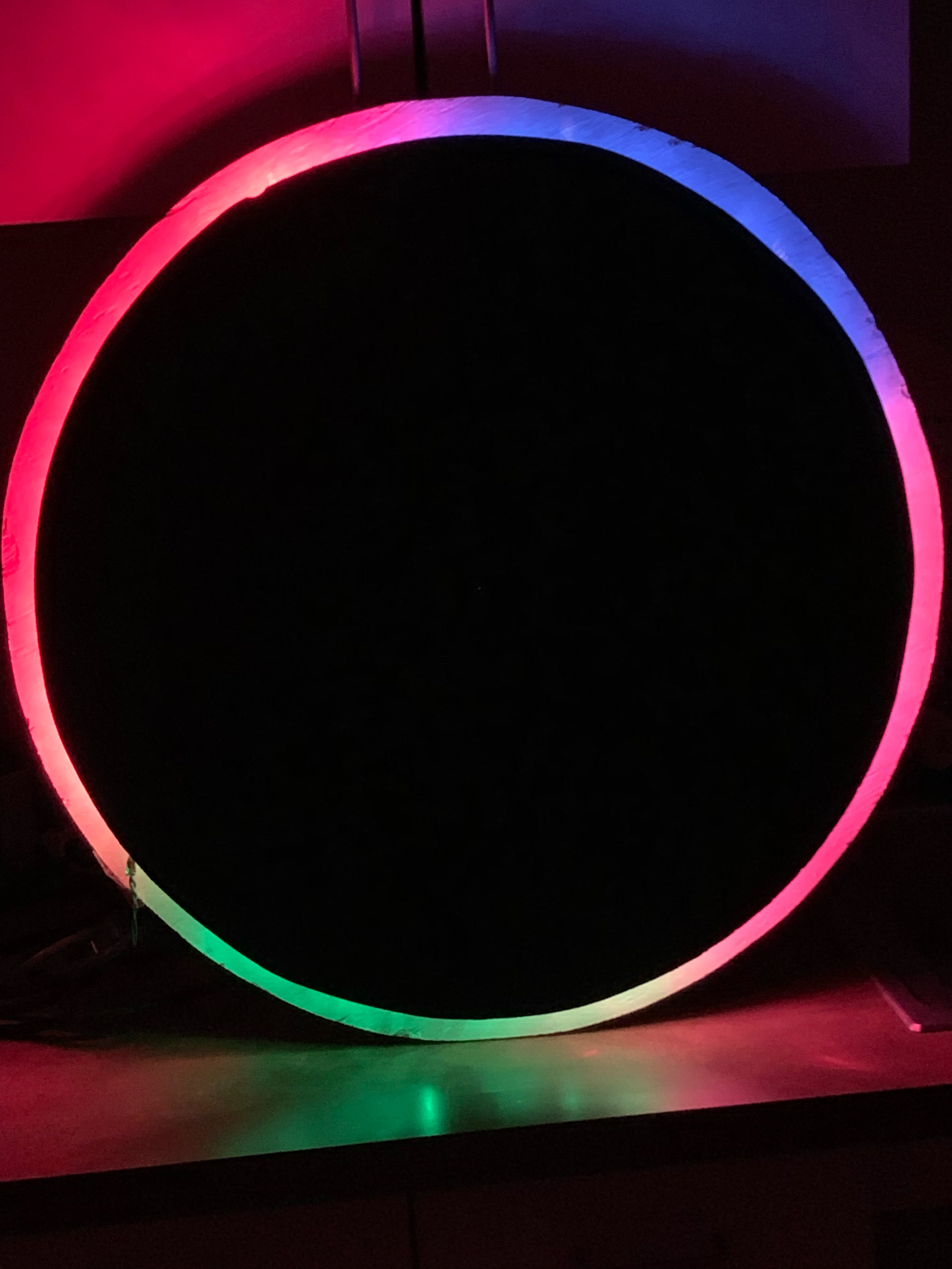
The Wallflower
Dubbed “The Wallflower” by Dr. Eli Blevis, our final concept was a circular disk which could be mounted on a wall that would light up to show different contributions as indicated by an array of colors. This shifting kaleidoscope of colors would reflect contribution levels of users in real time.
Colors and hues would be vague and anonymous so as to protect users’ identities, but by seeing a visual representation of their contribution somewhere public, we hope users will feel a sense of pride if their hue swells or shrinks, depending on their Goals.
Given more time - especially given the strong interest we received from IBM - we would like to create a higher fidelity physical prototype using sheet metal and LED lighting.


user comment: “I want to know if i’m talking over people. What if Eclipse tracked how many times you interrupted, but it only showed you and not your team lead? ” (tester 1)
future feature: private interruption tracking
Based on feedback from testers, we are experiencing renewed interest in interruption tracking - but with a twist. Especially given the insidious nature of “positive interruptions” a.k.a. “co-op”s as we explored in our research, interruption really is always bad. Yet pushing back against it without knowing the intent of the speaker is a risky gambit. We don’t want to punish people for being overzealous, but we do want to raise awareness. Future iterations of Eclipse, therefore, may see a private form of interruption tracking, which reveals to each user how many times they cut someone off - regardless of their intent.
Closing Thoughts
Design for Respect, They Said (II)
We set out to design for respect, and in the end we hope we did. In order to truly respect people, a design must not only accept but embrace their dynamism and simultaneity. People are complicated. They can be two things at once - even when those two things are seemingly at odds with one another.
In the end, we came to believe the best way to “respect” people is to not only find, but nurture - and empower - the parts of them of which they themselves are most proud.
An enormous thanks to our participants at Hewlett-Packard, IBM, UXG, Scientific Research Corporation, Verspire, Lichten & Liss-Riordan, Wexner Medical Center and Indiana University.
Design for respect, they said. It will be fun, they said.
And you know what?
It was.
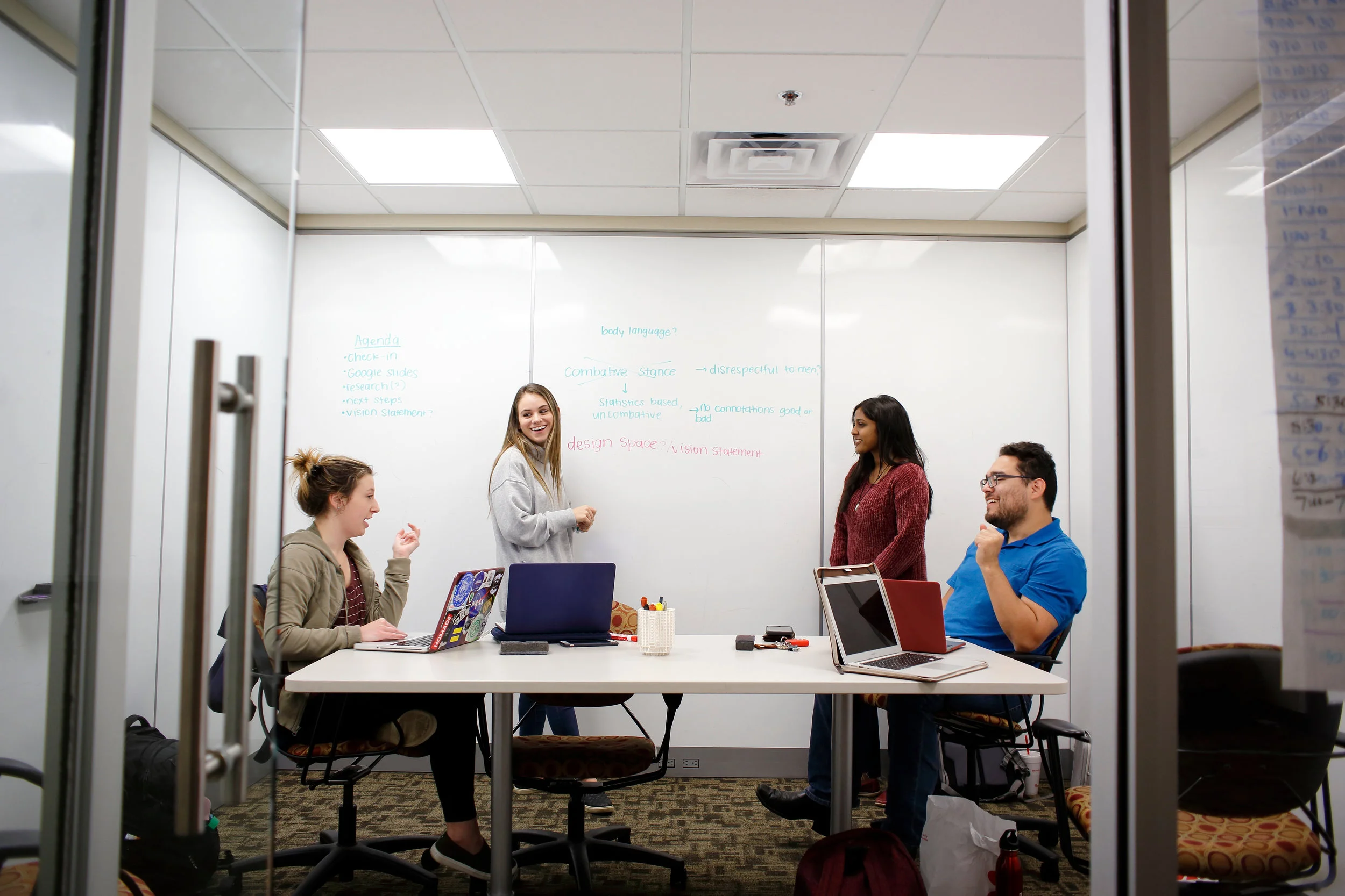
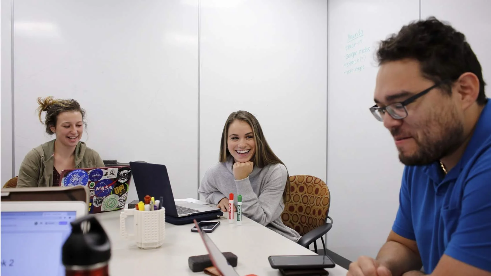
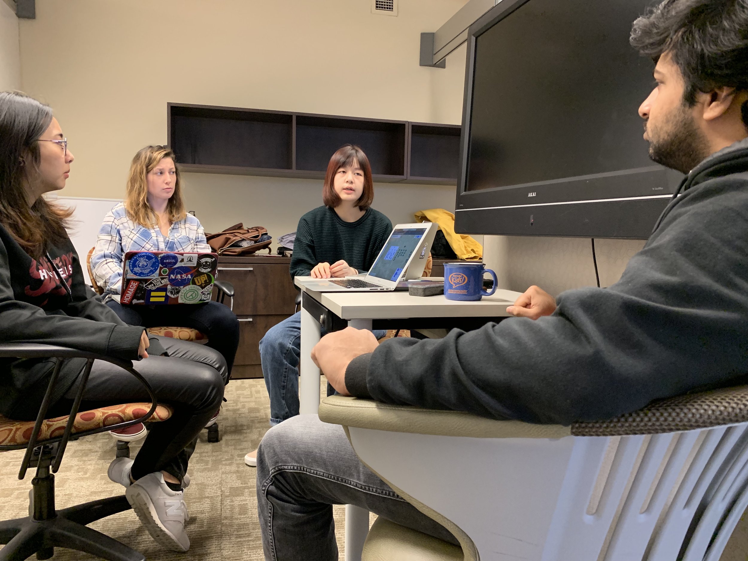
Shown Above: The team at work on the Eclipse in the design studio. Shown Below: (Left) The team at rest.
